(This is a guest post from Antoni Sawicki aka Tenox)
I spend most of time in a day staring at a terminal window often running various performance monitoring tools and reading metrics.
Inspired by tools like gtop, vtop and gotop I wished for a more generic terminal based tool that would visualize data coming from unix pipeline directly on the terminal. For example graph some column or field from sar, iostat, vmstat, snmpget, etc. continuously in real time.
Yes gnuplot and several other utilities can plot on terminal already but none of them easily read data from stdin and plot continuously in real time.
In just couple of evenings ttyplot was born. The utility reads data from stdin and plots it on a terminal with curses. Simple as that. Here is a most trivial example:

To make it happen you take ping command and pipe the output via sed to extract the right column and remove unwanted characters:
ping 8.8.8.8 | sed -u 's/^.*time=//g; s/ ms//g' | ttyplot
Ttyplot can also read two inputs and plot with two lines, the second being in reverse-video. This is useful when you want to plot in/out or read/write at the same time.

A lot of performance metrics are presented in as a “counter” type which needs to be converted in to a “rate”. Prometheus and Graphana have rate() or irate() function for that. I have added a simple -r option. The time difference is calculated automatically. This is an example using snmpget which is show in screenshot above:
{ while true; do snmpget -v 2c -c public 10.23.73.254 1.3.6.1.2.1.2.2.1.{10,16}.9 | gawk '{ print $NF/1000/1000 }'; sleep 10; done } | ttyplot -2 -r -u "MB/s"
I now find myself plotting all sorts of useful stuff which otherwise would be cumbersome. This includes a lot of metrics from Prometheus for which you normally need a web browser. And how do you plot metrics from Prometheus? With curl:
{ while true; do curl -s http://10.4.7.180:9100/metrics | grep "^node_load1 " | cut -d" " -f2; sleep 1; done } | ttyplot
If you need to plot a lot of different metrics ttyplot fits nicely in to panels in tmux, which also allows the graphs to run for longer time periods.
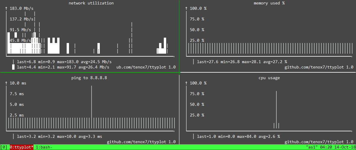
Of course in text mode the graphs are not very precise, but this is not the intent. I just want to be able to easily spot spikes here and there plus see some trends like up/down – which works exactly as intended.I do dig fancy braille line graphs and colors but this is not my priority at the moment. They may get added later, but most importantly I want the utility to work reliably on most operating systems and terminals.
You can find compiled binaries here and source code and examples to get you started – here.
If you get to plot something cool that deserves to be listed as an example please send it on!

